Monday, November 4, 2013
This image is my logo they way I am showing it now is in stencil form. This logo is used for my company "Technic Design". The focus and nature of my company is rough, dark and more obscure or alien like special effects. The company itself focuses on Props, Costumes and Make-up. Technic Design is prominently higher-ed for Sci-fi and creature included movies and T.V shows. I love to create lifelike and realistic creatures from out of this world. Which is why I chose such a strange creature for my logo.
The logo reflects my company because of its wild and obscure qualities that I try so hard to show in the my work. The creature has to large eyes in the center with a third above it to represent imaginative ideas that wouldn't come from this world. It has to large jaws on the sides of its face with three teeth each it also has three fin like appendages on the back of his head. After creating this stencil I had added three teeth in between the eyes to add a little more texture. Over the eye are supposed to only be three eye brows which would complete the three of everything which I only noticed a few weeks after creating it. The use of bold lines and obvious/ simple symbols allow the viewer to really see and understand the idea after a few seconds of looking at it. I like how this image can be placed in any setting and really look good on anything it isn't only typographic which i think really helps allow more freedom.
My logo had started from a character that I often draw in my sketch book so i had already perfected the look and feel of this character which made it very easy to transport into my logo. I didn't really have any problems because I already had designed it before this assignment but i did go through other ideas. Unfortunately the other ideas weren't very strong as logos so I decided to go with this. I think that the end result for this logo is just how I pictured and really feel that is strong, distinctive and really represents my style.
Tuesday, October 15, 2013
"The Time CUBE"
This piece was made for one of my year 4 sketchbook assignments. The topic i choose was "Do something with no apparent end or purpose." The image is of a character that has no end because he can travel to any fragment of time but he has no purpose he helps no one and does not use the information he gains for anything he just simply observes what happens through time. The large box on the ground allows him to travel through time, the large vest on his back is synced to the box which insures his entire body travels at once. The vest also stops him from ageing.
Tuesday, September 24, 2013
Process work for the week 2 sketchbook assignment
These three sketches are what i used for my sketchbook assignment. I scanned them individually and added colour, changed the levels and I also changed the position of the character for the first image.
Monday, September 23, 2013
Sketchbook assignment for week 2 of year 4
These images are for my sketch book assignment for Tuesday September 24 ,2014. I had scanned in a few drawing and added colour and an outline in Photoshop. The Sketch book topic i chose was "In a series of pictures or three dimensional works, show subject undergoing a change over a period of time".
The story is of a character that finds some kind of strange helmet. The character puts the helmet on and becomes a wicked beast.
Sunday, November 4, 2012
Inkblot Tests
These photos are of the inkblots that my group created we made these and were actually quite surprised to see that they all had very similar shapes. Example they all have these two circular shapes moving through them. They also look like they have wings of some kind. These images are in order from smallest to largest they we are going to create a larger amount of these and the difference in size will be allot smaller from one picture to the next.
These photos were edited by Alfonso and my self we changed the brown colour that they had to a nice black that looks more like ink the also had wrinkles and shadows which we also removed. These are perfect examples of the images we are going for.
Down By Law
DOWN BY LAW
In our latest assignment we were told to change the mood of a movie trailer ex: Barbie the movie becomes a zombie movie. I choose Down by Law because the mood is pretty dark but yet it still has some comedic moments. The director of this movie is Jim Jarmusch, He is a fantastic director.
When changing this movie trailer i wanted to eliminate the comedic part of the movie and make it more of a dark movie. I choose to use the parts of the movie that are darker such as the fight scene and the escape scene.
When choosing the music i chose a Tom Waits song called "Hell Broke Luce" because it is pretty descriptive of the trailer. It is pretty dark but it is very load and powerful which is what i am going for in the trailer.
In the future i would like to change the song to something more dark and less of the same vibe from the original trailer. Also i would like to change the ending cause i feel that i have given to much of the story away. I think i could shorten some of the scenes because i feel that people can make the connection from one scene to the next without showing the whole scene.
In conclusion I think that the trailer can be fixed and could be much better and will be resubmitted. I still like the mood was slightly changed but can be more obvious when i re do it.
Are ideas for the Palladio project
In Cyber Arts we have a project to create a video that will go along with a piece of classical music called Palladio. We as a group thought that it would be pretty cool to make ours like a visualizer. These are a few ideas of things that we would like to use in a video.
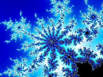
The image above is a still of a fractal.A fractal is a curve or geometric figure, each part of which has the same statistical character as the whole. We liked the look of fractals and it reminded us of life and how things grow decay and a new thing is born. And that is part of our concept evolution and life.
The image above is a photo of a rorschach inkblot test this image is to test the psychological mind of a person usually used by a psychologist. We really liked the look of these images and thought about animating them. We would create then photograph at least one hundred of these and the animate them. We would start with small ones then medium then large so that it looks like they are evolving.
Monday, October 29, 2012
Sunday, September 9, 2012
Friday, June 22, 2012
Thursday, June 21, 2012
Sharkbird
Shark bird
This
image was produced from a lino cut. The goal of the of the project was to
create a print that was a bird. In my case, I choose something that I had
created in my spare time, a Sharkbird. This crazy creation originally was a
stuffed animal, half cardinal, half shark. Both were cut in half and then sewed
together. I chose to use Sharkbird as my subject matter because in the past I
often experimented with building sculptures out of
found objects and parts of toys I had taken apart. The colours I chose for this
piece where red for the
cardinal, gray for the shark, blue for the sky and
white representing the lines. In the beginning I found this project quite
difficult especially because I had to make ten replicas. Some other problems I
had were, mixing the paint because some days I could replicate that colour and
other days the paint wouldn't want to mix. Registration of each layer was also
difficult. Overall I found the project challenging but fun.
Recon Helmet
Recon Helmet
My helmet is
based off a helmet from Halo 3. It is used in the online portion of the game.
The way I created this helmet was by printing out a net on cardstock. I had to
build it piece by piece which took a very long time. The next step was to coat
it with liquid resin on the outside and fiberglass resin on the inside. This
made it rock hard. The last steps were to sand and paint. The additions I made
to it were a visor and padding. The helmet took me about five weeks. It was a
very tedious and time consuming project but completely worth it. The next thing
I would like to do is coat it with Plasti Dip which is a plastic spray on
coating much like something you would apply to the handle of a pair of pliers.
Self Portrait
My self
portrait images communicate how I feel, excited yet kind of
confused about what is going on in life and school.
They also reveal some of my underlying and maybe not so happy thoughts, hiding
away. The computer generated portrait is more of a Pop Art style with a crazy
colorful trippy background. That is how I show my excitement towards life. My
intense background of the painted version, shows the same message but with a
different style. The style is more expressionistic. My painted version is quite
similar to the computerized version through the expression on my face. Both
show a serious, not amused face that reveal my hidden thoughts and problems.
The falling upside down, in both images, shows my confusion and discontent.
Overall I found the project fun and beneficial. I
liked the painting process more but found it all enjoyable. I think that I
showed the viewer how I feel.
Monkey Bird
Monkey Bird
This piece is a
sketch I had done in class. It was just concept work for the skull drawings we
were doing. It is a skeleton of a monkey with the head replaced with a parrot
skull. The medium is graphite. I like the detailed and precise style. The style
makes it look realistic scientific diagram. Yet it is an imaginary creature
like the Sharkbird. I sent it to Urban Voices and they seemed to have liked it
because it is going to be published in this year’s magazine.
Thursday, January 20, 2011
ARTIST STATEMENT for (Clay Animation)
The main characters of my Clay animation are the Dinosaur and the three little people. The story line for my Clay animation is that there is a dinosaur that is roaming the city of Purpleville. There are three young purple kids that are awfully frightened of the dionosuar and run away from it. The dionsaur is very sad and starts to cry ;(.
The message I am trying to get across in this movie is that it what’s inside that counts. I chose this topic because I think it is a big issue because most people judge others by there looks. I don’t think it is very fair to people how they judge each other.
The meterials I used were clay,some form of cardbord and water colour pencils.The program I used to edit my claymation is Imovie.
Friday, December 17, 2010
Subscribe to:
Posts (Atom)


.jpg)